1878 Cabinet 5
Moonlight
and candlelight
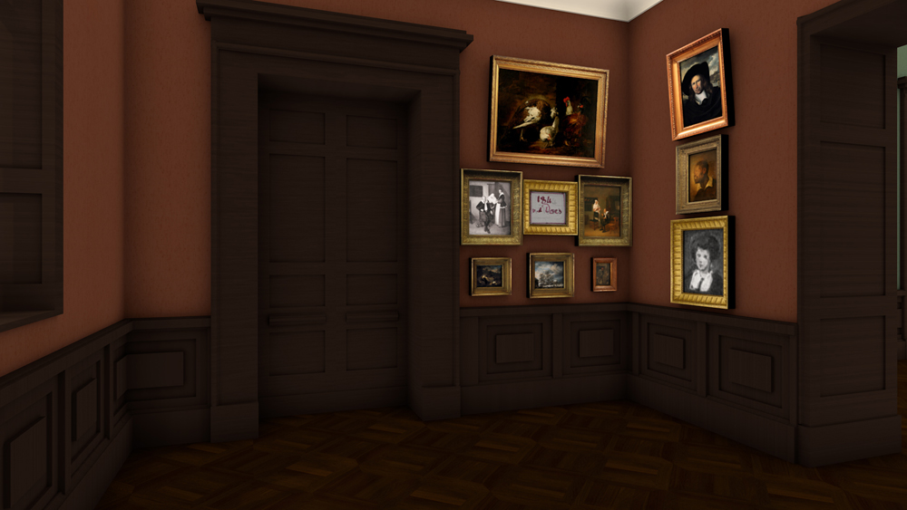
A special theme in this room was light. The paintings on the west wall in particular, visible to the visitor when entering the cabinet from the rotunda, presented different light effects.
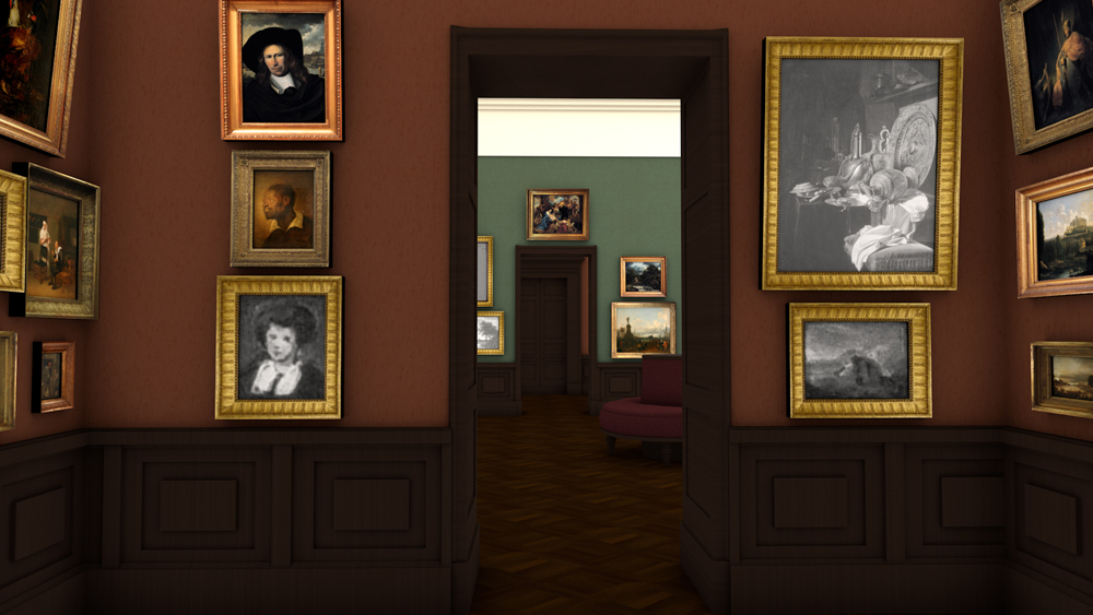
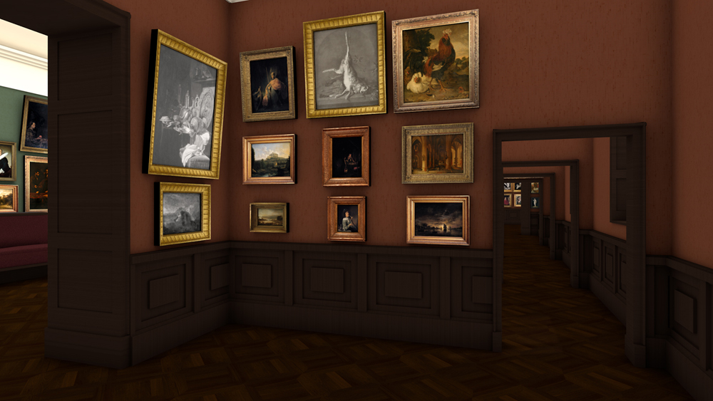
On the western cabinet wall, two night-time landscapes with a canal, painted by Aert van der Neer, were part of the lower register: one shows the moon shining through the clouds, the other landscape is depicted at dusk. The church interior by the Antwerp painter Pieter Neefs was illuminated by candles. Only one candle and a lantern light the painting by Gerard Dou, which was prominently presented in the centre of the wall. On the other hand, a work that nowadays is a central piece at the Städel Museum was pushed to the edge: Rembrandt’s “David Playing the Harp in front of Saul”, which similarly plays with light and shadow. At the time of the Städel’s opening in 1878, the painting was not attributed to the master himself, but to Salomon Koninck.
On the large still life painting across the corner, at the time still regarded as an original by Willem Kalf, the lighting effects on the shining metal objects are particularly eye-catching. Goethe had already described the painting as a victory of art over nature. In 1923, however, the Städel Museum sold the work, which today is located in Cologne.

Eventhough director Malß had changed the designation of the room from VI to III, the presentation could not have been executed in the third cabinet: the end wall of that room featured no door.
Basis
for the reconstruction
Städel director Gerhard Malß had changed the hanging plans for Cabinets 3-6, which were supposed to mainly feature seventeenth-century Dutch and Flemish paintings, a number of times. In the process, he changed the numbering of the rooms in such a manner that the presentation designs cannot easily be transferred from one room to the other.
The sketched architecture occasionally deviates from the actual rooms as well, as is also the case among the other hanging plans. This further complicates the interpretation of our sources.
That is why, for the reconstruction presented here, we have decided to ignore the renumbering of the rooms. In the case of Cabinet 5, we have also swapped the paintings on the two short walls, as only then the actual size ratios of the walls and the doors match. This occasional free handling of the visualisations is justified insofar as there is hardly any substantive reasoning behind the order of the cabinets. In the recreated version, however, the focus has lightly shifted. From landscape painting, which is placed rather low in the hierarchy of art genres, one passes peasant genres and domestic figure pieces to arrive at the more prestigious portraits and history paintings. In the individual cabinets, the visitor was able to deduce the respective theme through comparative viewing, while the use of symmetrical pendants on the one hand, and variation on the other, constituted the leading aesthetic principles.


