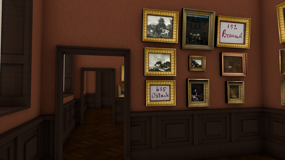
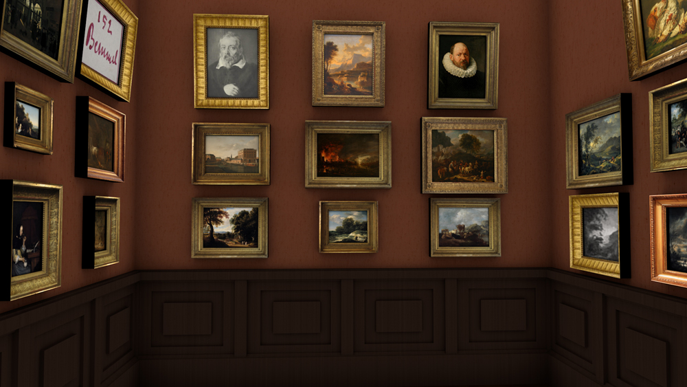
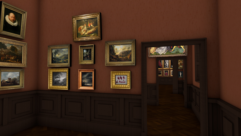
1878 Cabinet 3
Conflagration
and strange looks
Dutch and Flemish cityscapes, as well as landscapes reminiscent of southern painting, provided the “baseline” for this cabinet. A number of striking Flemish portraits formed their counterpoints.
Nowadays, the esteem enjoyed in 1878 by the painting prominently placed in the centre of the room’s end wall, a “Conflagration” in the style of Aert van der Neer, is hardly understandable. What stands out about the positioning of the two male portraits above this work – the portrait of the painter Frans Francken the Younger after Rubens being the one on the left – is that both painted figures are looking in different directions. This peculiarity, oft-repeated in the gallery, was obviously meant to ensure that the walls bordering each other were visually linked.

Eventhough director Malß had changed the designation of the room from VI to III, the presentation could not have been executed in the third cabinet: the end wall of that room featured no door.
Basis
for the reconstruction
Städel director Gerhard Malß had changed the hanging plans for Cabinets 3-6, which were supposed to mainly feature seventeenth-century Dutch and Flemish paintings, a number of times. In the process, he changed the numbering of the rooms in such a manner that the presentation designs cannot easily be transferred from one room to the other.
The sketched architecture occasionally deviates from the actual rooms as well, as is also the case among the other hanging plans. This further complicates the interpretation of our sources.
That is why, for the reconstruction presented here, we have decided to ignore the renumbering of the rooms. In the case of Cabinet 5, we have also swapped the paintings on the two short walls, as only then the actual size ratios of the walls and the doors match. This occasional free handling of the visualisations is justified insofar as there is hardly any substantive reasoning behind the order of the cabinets. In the recreated version, however, the focus has lightly shifted. From landscape painting, which is placed rather low in the hierarchy of art genres, one passes peasant genres and domestic figure pieces to arrive at the more prestigious portraits and history paintings. In the individual cabinets, the visitor was able to deduce the respective theme through comparative viewing, while the use of symmetrical pendants on the one hand, and variation on the other, constituted the leading aesthetic principles.


